Carl Pei is out to shake up the smartphone market with Nothing Phone 1. The CEO of London-based tech startup “Nothing” has had enough of phones that look identical. And, we’ve got to admit, he has a point.
Can a smartphone still be incredible? They were, once upon a time, in those days when they were more luxury than ubiquity. But what happens when everyone has one — and, more to the point, we all pretty much have the same one? Phones aren’t a fashion product. They’re not clothes or shoes or even cars. Chances are probably roughly equal that you’ve got the same one as the world’s richest billionaire. Or the person who bags your groceries.
There’s never been a good or easy time to launch a new smartphone company. It is difficult to separate the Nothing Phone 1 from the hype around it. There’s not much design innovation in the current mobile phone companies in 2022. Most models seem like interchangeable glass slabs, and it’s refreshing to see something different for once. Nothing’s debut phone may look like an iPhone 13 from the front. But there’s nothing quite like the eye-catching transparent design of its rear panel.
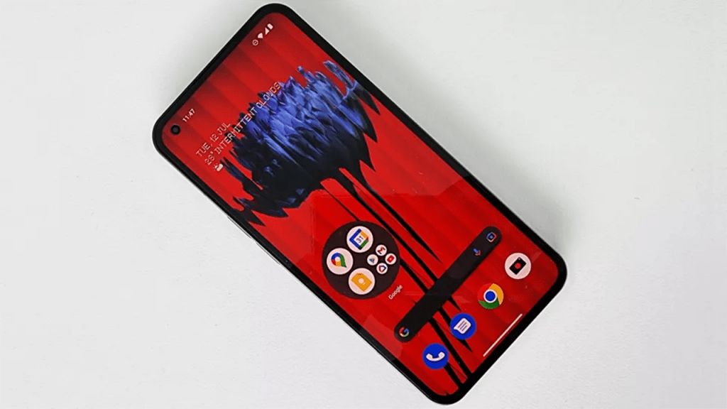
The shiny new Nothing phone 1’s promise to be “a wake-up call for the industry”. Might be a little too hyperbolic for us. But we can’t deny it. As we haven’t seen anything that looks like as much of a conversation starter as this does in a while. And that’s before talking about the £399 starting price. Which makes it more affordable than the Google Pixel 6 or Apple’s iPhone SE.
Nothing phone 1 Key Specs:
- Screen size: 6.55in
- Resolution: 2400 x 1080
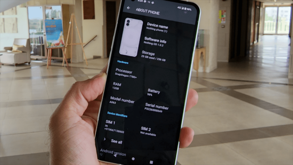
- Processor: Qualcomm Snapdragon 778G+
- Cameras: 2 rear cameras (50MP main and 50MP ultra-wide angle) and 16MP front camera
- RAM: 8GB or 12GB
- Storage space: 128 GB or 256 GB
- MicroSD card slot: No
- Weight: 193.5g
Nothing phone 1 Design:
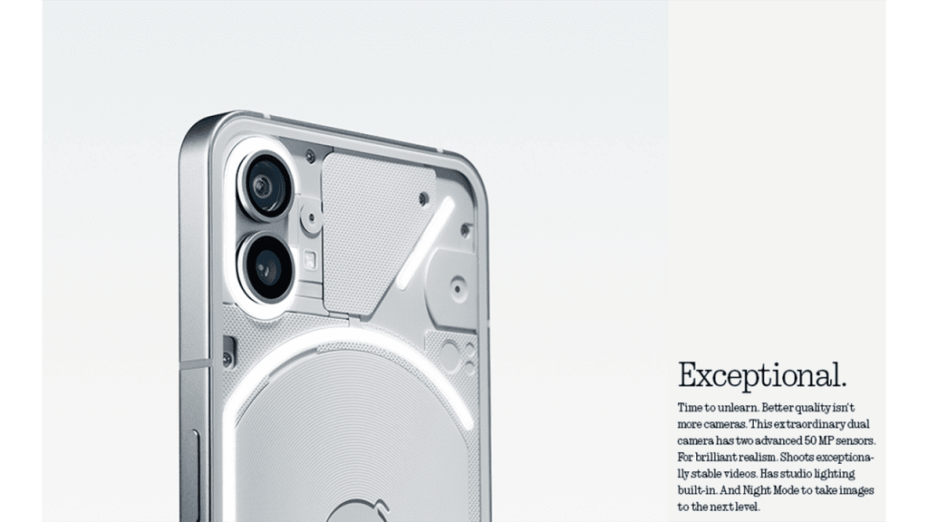
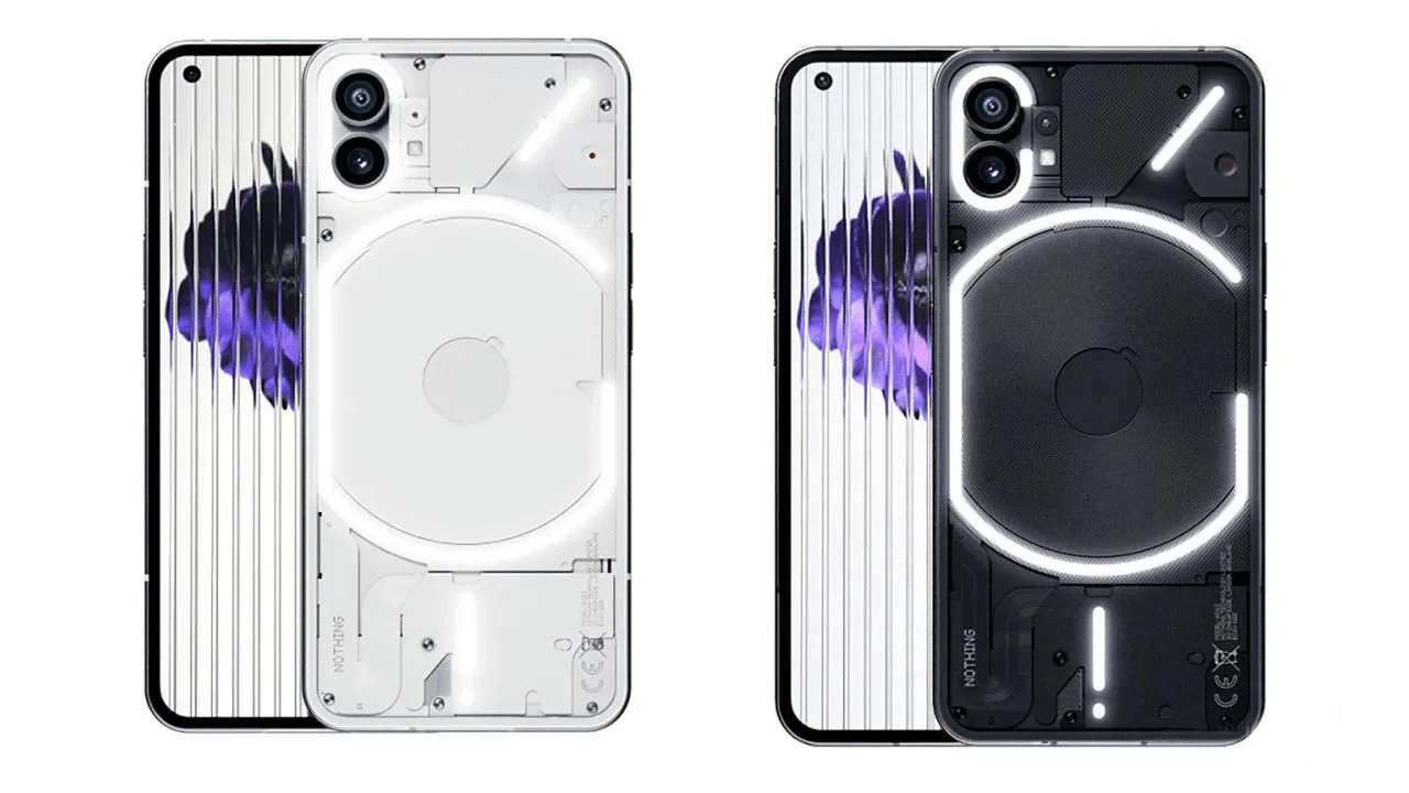
The Nothing Phone 1 looks nothing like any other phone available. Sure, the front and back glass sandwich a metal chassis, but the phone’s rear is transparent. Because of this, it shows the internal components and is lit up by Nothing’s fancy Glyph LED lights. Ignore the naysayers — it’s fun, unique, and downright cool. The phone comes in black or white colour. It is 8.3mm thick and weighs 193 grams. It’s sensible to use with one hand. It’s not too bulky or wide and slips into most pockets and bags without a fuss.

The flat-sided metal body looks very slick, but it’s not that comfortable to hold for extended periods, much like the iPhone 12 Pro Max and iPhone 13 Pro Max; it’s so clearly imitating. There is a hint of a chamfered edge, but it’s not enough to make the phone as comfortable to hold as the Xiaomi 12 Lite, which shares a similar design. The phone’s 193-gram weight is just right, making it pocketable and never fatiguing to hold. There is a transparent case for the Nothing Phone 1 in the box, which reduces the way the phone digs into your palm.

The transparent back of the Nothing Phone 1 looks ace. All the phone’s guts are actually covered up, leaving the wireless charging coil as the only naked component on show. That may initially disappoint some folks, but in reality, it’s a good thing. Components are usually ugly, and aesthetics aren’t taken into account when laying out the inside of a phone. Covering them up with different-shaped panels under the glass gives the Nothing Phone 1 a cool, sci-fi look.
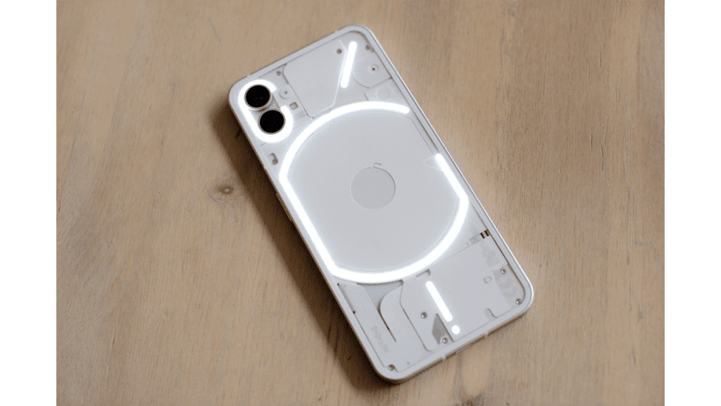
Nothing has designed a phone that doesn’t look like any other and has a unique element that genuinely catches the eye when activated. Considering this is the debut phone from a modestly sized startup, it feels incredibly substantial and well-made. Some question why the Phone 1’s looks have caused a furore and dismiss it all as hype, but this is cynical and myopic.

The past year has seen many good-looking smartphones emerge, yet Nothing still managed to develop something fun and unusual. Reducing the Phone 1’s design to little more than a collection of flashing lights for people attracted by such things or simply dismissing it as an iPhone clone misses the point. What we’re seeing is Nothing continues to build its brand identity, which started with the Nothing Ear 1 true wireless headphones. Whether you like or loathe the look, it’s already immediately recognizable. It’s fascinating to see, and very few brands start with such a clear design vision, let alone after just two products. It bodes well for the company’s future in design.
It’s safe to say that the report bore out. The transparent back, coupled with the “Glyph” LED lighting arrangement is, by far, the phone’s most striking visual element, sharing a language with Nothing’s transparent earbuds. Stripped of that aspect, it looks an awful lot like an iPhone. “I’ve gotten that feedback,” Pei told me when I brought this up. “It’s the most efficient use of space.”
Is the current iPhone some platonic ideal of smartphone design? I guess it is until it isn’t, and someone else figures out something better. Perhaps this speaks to another limitation: physical design and use of space. Sure, Nothing could have gone out of its way to produce something entirely different, but 1) good luck finding a manufacturer that will work with you, and 2) you’re suddenly catapulting yourself into the world of function over form. There’s certainly some wiggle room to play with, but a phone needs to be functional first, and then you can start worrying about the other stuff.

Ultimately, when you choose utility, you’ve got to find other ways to stand out as a genuine alternative in the same world of handsets. That’s the liminal space the Nothing Phone occupies. It’s a thought experiment into how one can differentiate oneself in a product category that’s already so mature and well defined.
However, one thing that’s undeniable is that the form factor is solid. The combination of glass and metal and the device’s heft affords the Phone (1) a premium feel. It’s not heavy — certainly not for a phone this size — so much as substantial. Build-wise, there was never a point I felt like I was carrying around anything but a flagship.
Nothing Phone 1 Glyph Interface:
- Unique LED notification lighting system
- Customizable patterns for ringtones and notifications
- Doubles as a fill light when shooting video

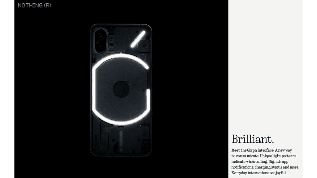
The Glyph Interface is the name given to the lights, haptics, and sound effects that make the Nothing Phone 1 unique. They activate mainly when the phone rings or a notification comes in. They consist of 10 sets of unique ringtones and notification alerts, all of which flash the lights in different patterns, vibrate the phone differently, and make different sounds when something happens. Otherwise, the LEDs come to life to show charging status and when Google Assistant is listening and can be used as an alternative to the flash in the camera app.
The LEDs are diffused to form bars of light that run around the edge of elements like the rear camera module and wireless charging coil, and each segmented Glyph can light up independently of the others. It’s a unique feature that Nothing has used in several creative ways.

Dipping into the Glyph Interface’s settings menu, you can customize what the glyphs react to and when should they react. By default, they’re paired to one of Nothing’s ten own-brand ringtones and notification tones. The various light and haptic patterns perfectly synchronized – in terms of brightness and motion, respectively – to each audio.
The glyphs’ usefulness goes beyond glanceable notifications, however: they can also act as a battery charge indicator for both wired charging and reverse wireless charging, show when the Google Assistant is listening – signifying it’s picking up your spoken commands, and serve as a soft light when you’re shooting video or portrait mode shots, in place of the camera’s single LED flash.

The blend of novelty and functionality that the Glyph Interface delivers undoubtedly caters to the sense of ‘fun’ that Nothing has so keenly pushed as one of the primary intentions behind the Phone 1. We just wish there was a little more customization and personalization on offer.
The ability to tie different glyph patterns and ringtone pairings to specific contacts in your address book is excellent. Still, there’s unquestionably room to expand this functionality to app-specific notifications (there is a way to enable these, but it isn’t intuitive and requires you to dig around in Android’s native settings), in-game actions, and the option to compose your glyph patterns in conjunction with your own tones and other tunes would be nice too.

Thankfully, having spoken with the team at Nothing during the phone’s launch, it’s clear that aspects of the Phone 1, including the Glyph Interface, will continue to evolve, no doubt influenced by new users, now that the phone is officially on the market.
Nothing Phone 1 Display:
Look, there’s nothing to complain about when it comes to Nothing’s display (pun intended), especially at its sub-£400 price. It’s large, crisp and colourful, with more than enough brightness.
This OLED panel rivals flagship models like the Pixel 6 regarding resolution, and it delivers a dynamic refresh rate that can go from 60 to 120Hz – this is a fancy way of saying that it’ll make scrolling and animations look smooth and feel more responsive to your touch. If you haven’t had a higher refresh rate screen before, it’s hard to picture.
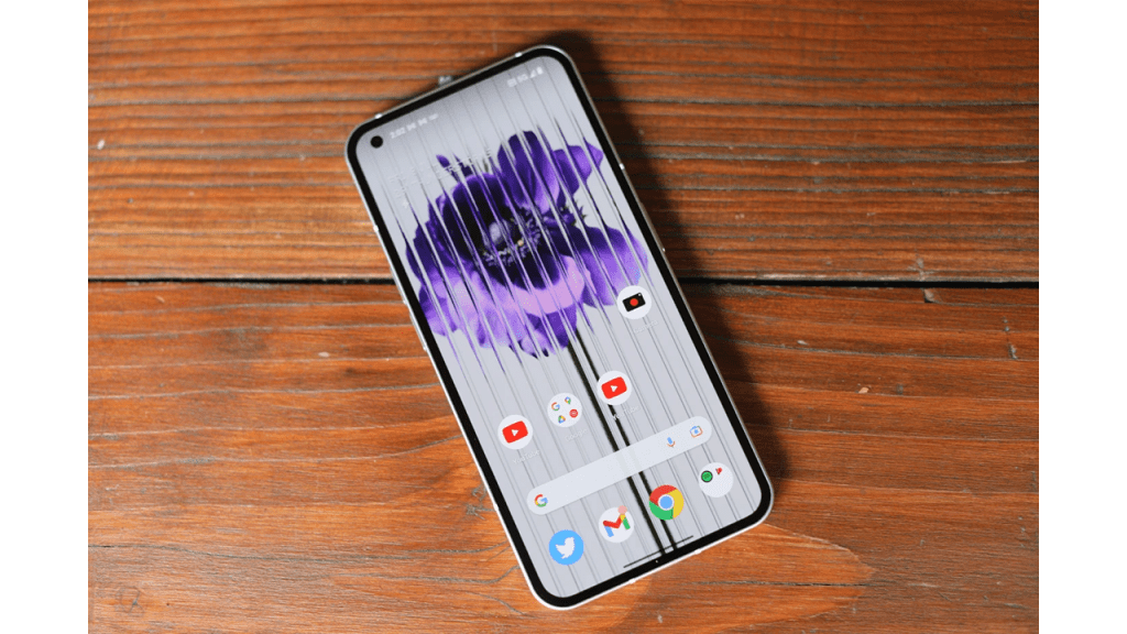
- 6.55in Full HD+ flexible OLED display
- Adaptive 120Hz refresh rate
- The evenly-sized bezel on all sides
- Low optical in-display fingerprint sensor
Nothing has graced the Phone 1 with a 6.55-inch Full HD+ OLED panel, boasting a 120Hz high refresh rate and HDR10+ compatibility and 10-bit colour support.
A not-insignificant bezel surrounds the screen, but it claws back some aesthetic points by sporting a consistent thickness all the way around. (something that’s not always a given and not easy to achieve from an engineering standpoint), made possible by Nothing’s decision to use a flexible OLED in place of a less expensive rigid panel.
The phone’s punch-hole front-facing camera sits in the top-left corner of the screen, while an optical in-display fingerprint sensor sits low and close to the bottom edge of the panel.
Despite the technical advantages an OLED display usually brings, there’s no always-on functionality yet (Nothing hasn’t confirmed whether it’ll add such a feature later). However, a faint ring demarcating the fingerprint sensor’s placement lingers on the screen when the rest of the display shuts off. Despite the handset offering raise-to-wake functionality, you don’t need to rouse the Phone 1’s display before pressing on the sensor to gain access, which makes it that little bit more convenient.

As for the panel’s output, the Full HD+ resolution offers a perfectly sharp image suited to enjoying social media and streaming video. With brightness generally topping out at a quoted 500nits (with a promised peak brightness of 1200nits), that, in practice, seems wholly serviceable in all scenarios up to bright, direct sunlight where visibility starts to suffer.
OLED tech ensures a vibrant picture, paired with two colour profiles: Alive (the default) and the more muted and natural-looking Standard, with a bit of extra fine-grain control, thanks to a colour temperature slider.
A 120Hz high refresh rate, paired with a 240Hz touch response rate, means swiping around the Phone 1’s interface – as well as more demanding experiences, like gaming – look and feel pleasingly snappy.
The refresh rate is also dynamic to help with the power efficiency. It can automatically switch up and down in frequency (Hz) based on what the phone is doing; the lower the Hz, the less fluid the motion appears on-screen, but the less drain on the battery the display becomes.
Nothing Phone 1 Camera:
- Two capable rear cameras
- Decent selfie shooter
- Video recording LED
The camera is arguably the core spec that Nothing has pushed the furthest. And in a way, that’s out of step with many rivals. It’s increasingly common for phones at this price to feature three or even four cameras on the back, but usually, only one of them is good enough to use.
By contrast, Nothing has restricted itself to two rear camera lenses: one primary and one ultrawide. Neither are flagship quality, but they’re capable considering the price, though there’s a drop-off at night.

The primary lens uses the 50Mp Sony IMX766 sensor, which can be found in phones ranging from mid-range rivals like the OnePlus Nord 2T right up to top-tier flagships like the Oppo Find X5 Pro.
It’s bright, punchy, and capable of some beautiful shots in most lighting conditions. There’s even enough detail to hold up well when you punch into the 2x digital zoom option. (If you’re on a desktop, you may have to drag to slide through the slideshow).
Support for optical image stabilization (OIS) helps the primary camera even handle low light well enough, though far below flagship standards. This is where software and camera algorithms work their magic, and as a fledgling company, it’s no surprise Nothing isn’t competing with the big dogs here.
Light sources will still become blown out, and there’s a softness to most night mode shots despite the OIS, but the phone does manage to pick out details that would otherwise be lost in darkness. There’s also the option of using the Glyph interface fill light as a less aggressive take on a flash for close-up night-time shots. I found the results a little harsh, but it beats flash and is a neat extra option for portraits or food photos in dimly lit restaurants. Here’s the same shot taken with the regular camera, with night mode, and then with the Glyph fill light in the standard mode & night mode.
Then there’s the ultra-wide. Although this is also a 50Mp shooter, it doesn’t use the same Sony sensor. Instead, it’s Samsung’s JN1 image sensor, and there’s an apparent decrease in quality compared to the primary camera.
Shots from this camera come out washed out and faded compared to the primary lens, though you may prefer the more subdued hues. Without OIS, there’s also a more noticeable drop at night, with details typically lost into a blurry smudge. It’s not a terrible lens – and still better than the ultra-wides in most rivals, to be fair – but don’t expect something to match the primary camera.
The biggest surprise for me was the 16Mp selfie camera. On paper, it’s nothing special, but I found shots came out well exposed and attractively lit, while the portrait mode did a decent job of subject detection. No complaints here.
You can record video up to 4K@30fps on both rear lenses, but the front camera is capped at 1080@30fps. Video settings are basic and pretty typical, but there’s a welcome option to turn on a flashing red LED on the rear while recording – another fun flourish.

This is also where the Glyph Interface fill light option comes into its own, adding extra lighting that vloggers will appreciate – though be warned that the end effect is subtle and not on the level of a proper ring light.
Specs & Performance:
The Nothing Phone (1) is powered by Qualcomm’s Snapdragon 778G+ – a mid-market chipset launched in October last year.
This chip, more than anything else, gives away the Phone (1) ‘s mid-range price, as it’s both a tier below the flagship Snapdragon 8-series and a little old. It’s since been supplanted by the Snapdragon 7 Gen 1.
I don’t want to overegg the downsides, though. Sure, if you’re expecting to use your phone for competitive online gaming, you may find the 778G+ holds you back, but it’s got enough power for almost anything else you might throw at it.
Benchmark performance results are solid and typical for the price – it’s in line with the OnePlus Nord 2T and outpaces Samsung’s under-powered Galaxy A53. I’ve found the phone fast and responsive in the real world, with little lag to speak. It’s fast enough but not spectacular.

The 778G+ is paired with your choice of 8GB or 12GB of RAM and 128GB or 256GB of storage – though note that the cheapest 8+128GB version of the phone is only available in black, not white. So far, it means:
- Mid-range Snapdragon 778G+ chipset
- Various RAM and storage options
- Limited connectivity in the US
Performance-wise, the phone can hang. It performs well, particularly with those devices in its price range. Sure, some trade-offs come with not adopting this year’s latest flagship chip, but nothing that should have a profound impact on your daily use. The chips are coupled with a solid starting 8GB of RAM and 128GB of memory. There are three tiers, ranging from £399 ($473) to £499 ($592) for 12GB/256GB — again, positioning the product in the mid-tier.
The company determined that bleeding-edge specs weren’t the hill to die for. This much is understandable. Going head-to-head against Samsung and Apple in an all-out spec war is a game you will lose. This is most glaringly obvious in the case of the chipset. The inclusion of the Qualcomm Snapdragon 778G+ chip puts the device firmly in the mid-range category. There are trade-offs like every other aspect of building your first phone in 2022.
I’d assumed the decision was largely budgetary. I suspect that still played a factor in the decision, but ultimately Nothing’s choice not to go all-in on the latest flagship chip was a bit wonkier than that. Pei said the decision to go with a TSMC fab — rather than Samsung — is what pushed it over the edge. “It was a difficult choice because we knew there would be people saying, ‘hey, what are you doing? It’s not the latest.’ But I think it’s the most responsible choice in the seven series.”
Then there’s connectivity. The Phone (1) has the usual suite: 5G, Wi-Fi 6, Bluetooth 5.2, and NFC for Google Pay. The only thing to flag is that the phone isn’t guaranteed to work well in North America, where signal bands are pretty different. Nothing warns users can expect “unpredictable” service on T-Mobile, no voice-over-4G on AT&T, and no Verizon service.
In fairness, the phone isn’t on sale there anyway, but it’s something you’ll need to know if you’re an American considering an import or simply someone who travels to the States often.
Specs
- Qualcomm Snapdragon 778G+
- 8/12GB LPDDR5 RAM
- 128/256GB UFS 3.1 storage
- 6.55in 120HZ OLED display
- Rear cameras:
- 50Mp, f/1.9 OIS main camera
- 50Mp, f/2.2 ultrawide camera
- 16Mp, f/2.5 selfie camera
- 4500mAh battery
- 33W wired charging
- 15W wireless charging
- 5W reverse wireless charging
- 5G
- Stereo speakers
- Wi-Fi 6
- Bluetooth 5.2
- NFC
- Glyph Interface LED lights
- IP53
- Gorilla Glass 5
- Android 12 with Nothing OS 1
- 159.2 x 75.8 x 8.3mm
- 194g
Battery life:
- 4,500mAh battery
- Support for 33W fast charging
- Underwhelming longevity
- Fully recharges quickly
Where the 778G+ (and an Android user experience in need of further refinement) does fall is with battery longevity. While there’s an argument for the phone’s ability to learn and optimize power management based on usage patterns, baseline longevity underwhelms.

Behind the glass and the visible components, the Phone 1 packs in a 4,500mAh battery, which Nothing claims delivers up to 18 hours of use per charge.
In practice, however, the Phone 1 consistently doled out around five hours of screen-on time, which should be considered the bare minimum for what to expect from a purchase-worthy smartphone.
A single charge handled emails synchronizing from a couple of addresses, about 45 minutes of video streaming, an hour’s social media use, light camera usage, 20 or so minutes of web browsing and messaging, all topped off with 15 minutes of gaming, before sitting at critical battery before bed.
As such, don’t expect to indulge on the Phone 1 and get away with it; you will likely have to put the phone on charge before bed if you’re planning on binge-watching a Netflix series on a long train ride, for example. Anything less demanding and a full day’s use is within reach, but only just.
As for recharging, the Phone 1’s battery officially refills to 50% in 30 minutes – provided you’ve picked up a compatible PD 3.0/Quick Charge 4.0-compliant adapter that meets the phone’s maximum fast-charging speed of 33W.
Nothing offers its 45W power adapter (£35 / €35 / around AU$60), but it doesn’t include one in the box, meaning all you’ll find is a white USB-C to USB-C cable.

Our unit (using a third-party 27W PD adapter) managed to reach over 65% charge after 30 minutes of plugged in, with a full charge constantly completing in a sliver over an hour, which is better than what we were promised.
Nothing Phone 1 Price & Availability:
The Phone (1) is available to order now in the UK, Europe, and Asia. As a reminder, it won’t launch officially in the US or Canada, and importers should be cautious, as the phone may not work fully in North America.
I’ll admit that I was a little surprised when I got to know the Nothing Phone 1’s price. I knew it would be positioned competitively, but the final price still seems bullish. Here’s how the three versions stack up:
- 8GB + 128GB: £399/€469/₹32,999
- 8GB + 256GB: £449/€499/₹35,999
- 12GB + 256GB: £499/€549/₹38,999 (launching in late summer)
If you’re tempted, you can grab the phone directly from Nothing, Amazon, Selfridges, or O2 in the UK. It’s also available from Amazon across Europe and Flipkart in India, and we have a dedicated guide on the best Nothing Phone (1) deals we’ve found.
We’ve already mentioned its main competitors. Carl Pei’s former company, OnePlus, offers the excellent Nord 2T at almost the same price, while the Samsung Galaxy A53 and iPhone SE are also close. The Google Pixel 6a is also right around the corner, making this spot in the market even more competitive than it usually is.
Operating System:
Nothing gave users a taste of its bespoke Android-based user experience ahead of the Phone 1’s launch by releasing a launcher which can be installed on supported phones from other brands; however, the native experience offers a lot more depth.
- Near-stock Android user experience
- Nothing OS adds useful, characterful features
- Three years of OS updates and four years of security updates guaranteed
- Needs resource optimization for performance and power
The brand’s signature dot matrix font can be found across the phone’s hardware – on its glass back and even in the SIM tray – also carries across to the user interface, dubbed ‘Nothing OS’, fronting menus and select widgets.
Nothing OS falls into a similar camp to that of Motorola’s and Google’s take on Android, with mild adjustments that set it apart from a truly stock experience: folders can be enlarged to occupy a 2 x 2 space on a home screen, offering hybrid functionality; specific quick-settings widgets can be swiped through, providing more connectivity options at a glance; and, while it’s tucked away, there’s even a pop-up view for more convenient multitasking.

Some inclusions – like the smart home control shortcut on the lock screen – feel particularly powerful. However, there are also signs of work still needing to be done regarding stability. There are absent features such as a one-handed mode. That would benefit the particular user experience offered by Nothing OS running on the Nothing Phone.
The software doesn’t nag you to change this setting, try that feature. Or use a different app, mainly because there aren’t any excessive apps or features. It’s a wise move on Nothing’s part. This brings the Phone 1’s experience closer to the Pixel 6 than the OnePlus Nord 2T. The design is clean and quite similar to Android on the Pixel, apart from a few little additions by Nothing. For example, there are four different Nothing clock widgets and a pair of large multifunction connectivity panels under Quick Settings. If you were worried Nothing was going to cover NothingOS in its pixel-themed font, then don’t be. It’s all relatively normal.

Using the Nothing Phone 1 is comfortable, effortless, and satisfying. You quickly fall into a rhythm with the phone, something that takes time on phones with more complicated, attention-seeking software. It’s not without faults or quirks, but most of them are only minor annoyances. For example, there’s no on-screen button to activate the camera from the lock screen. And the Google Search bar on the Home screen is fixed and can’t be moved or removed. Considering this is Nothing’s first phone, it has done an awe-inspiring job with the software overall. Which I haven’t wanted to stop using.
Nothing needs to continue this theme for future devices. And not give in to pressure to add more features or apps. Currently, It stands apart from the various ColorOS clones, Samsung’s OneUI and Xiaomi’s MIUI. And is an excellent alternative to Android 12 on a Pixel phone. There’s a slight concern that it may already be falling into that trap. The Nothing Phone 1 has a feature in beta for Tesla owners to connect their car to their phone. There’s an NFT app, too, but this has not appeared on the phone.
While the general operation of the Nothing Phone 1 is comfortable and enjoyable. There are still bugs throughout, but few affect general everyday operations. Also, we were expecting more coherence between the Nothing Ear 1 headphones and the Phone 1. But it’s not functioning very well yet. The earbuds connect, but there’s no way to control the noise-cancellation effects without the app. And the built-in connection panel just shows “connecting …” despite the ‘buds being connected. If the Phone 1 is trying to be an iPhone. It has a long way to go to beat the excellent iPhone/AirPods interface.
Nothing deserves kudos for promising three years of OS updates and four years of security updates to Phone 1 owners. Making the device that much more appealing in terms of value for money and longevity.
Should You buy the Nothing Phone 1? Our Verdict.
Considering that Nothing is a new challenger to the smartphone market. There’s a lot it’s got right with its first handset. This is an impressive and capable model with a great display, solid performance & a decent camera. Which is good enough for most shots.
As a phone, the Phone (1) is an almost unqualified success. The limited battery life and minor bugs and issues We’ve encountered are the only fundamental weaknesses. While the capable cameras, IP53 rating, and wireless charging all stand out from the pack.
That’s before we even get to the design. Perhaps it will prove divisive, but you certainly couldn’t call the Phone (1) boring-looking. Ultimately, the semi-transparent rear and LED patterns will demonstrate the main reason to consider picking the Phone (1) up.
Buy it if.
1) You want a polished all-rounder that won’t break the bank
Sure the battery life isn’t great, but the Phone 1 charges quickly. It also delivers a balanced user experience at a price that belies its premium finish.
2) You believe in Nothing’s story and Phone 1’s intent
Nothing is a small company trying to do things differently in an incredibly competitive and over-saturated market. The Phone 1 is the perfect embodiment of this approach. Designed to start a conversation and delight users with its eccentricities.
3) You live with your phone on silent.
Beyond its novelty. The Glyph Interface’s various functions make it a handy tool to keep tabs on calls and activity on your phone. Without being distracted by constant dinging and on-screen notifications.
As the first step in a smartphone revolution, I’m less impressed. Beyond all the glowy bits, there isn’t anything here that we haven’t seen before. And once this novelty wears off, you will only have a phone which is the same as all the others.
Don’t Buy It If.
1) You want a conventional flagship-class phone.
The Phone 1 doesn’t compete in areas like raw performance and battery endurance or offer a class-leading camera. It sports an attractive design, is fun to use, and is affordable. If those aren’t on your list of priorities, look elsewhere.
2) You need a phone with good battery life.
Despite an otherwise balanced experience, the Nothing Phone 1’s battery life is not so great. At least it recharges pretty quickly.
3) You want a killer camera phone.

The Nothing Phone 1 sports a perfectly functional set of cameras. But its quality and functionality are a little too rudimentary to be competitive against entries like Google’s Pixel 6.
Our take:
Quirky, individual, and enjoyable to use. The Nothing Phone 1 succeeds in being different from any other smartphone, at least on the outside. Inside, things are substantially more familiar. The software shares plenty of stylistic and interface similarities with the Google Pixel series. It has a reasonable price, the specifications are good, the software is enjoyable to use. And it looks and feels different from any other Android phone out there.
However, it’s not perfect. There are plenty of software bugs to squash, the camera needs tuning, and the battery life is short. However, it’s the first phone from a reasonably new brand. And I’ll take a few software-related issues at this stage. As Nothing could be swift with software updates to fix them. If it does, the Phone 1 will be a considerable bargain. However, if it doesn’t swiftly fix at least some of the problems, then my opinion could rapidly change.
For now, the Nothing Phone 1 is a recommended buy. Provided you understand this is the first phone released by an (admittedly well-connected and well-funded) startup. And with that, you’ve got to expect there to be some teething issues. It’s still an inspiring start for the company though. And Nothing is undoubtedly well on its way to meeting its target of creating tech that blends into our lives.



I truly admire how you tackle difficult topics and address them in a respectful and thought-provoking manner